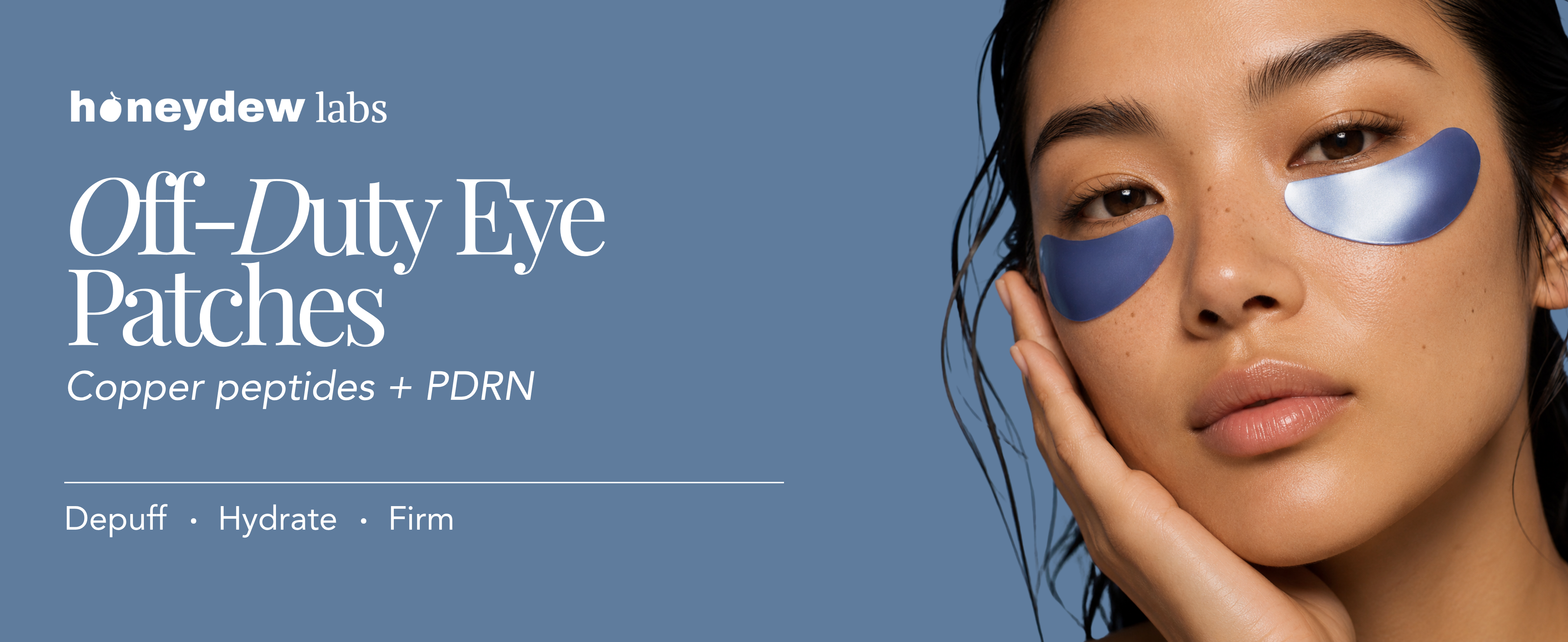
Honeydew Labs
Designing a premium skincare product from the ground up
Role
Timeline
Team
Skills
Competitive Research
Visual Identity
Overview
Bringing a new Copper Peptide + PDRN eye patch product to life.
At Honeydew Labs, I had the opportunity to help shape a new skincare product from its early stages: Copper Peptide + PDRN Eye Patches.
As eye patches gained momentum across the beauty industry, Honeydew saw an opportunity to enter the category while exploring an emerging skincare ingredient: copper peptides.
I was responsible for designing the product's packaging and helping translate its positioning into a visual identity that felt elevated, credible, and distinctive within a crowded skincare market.
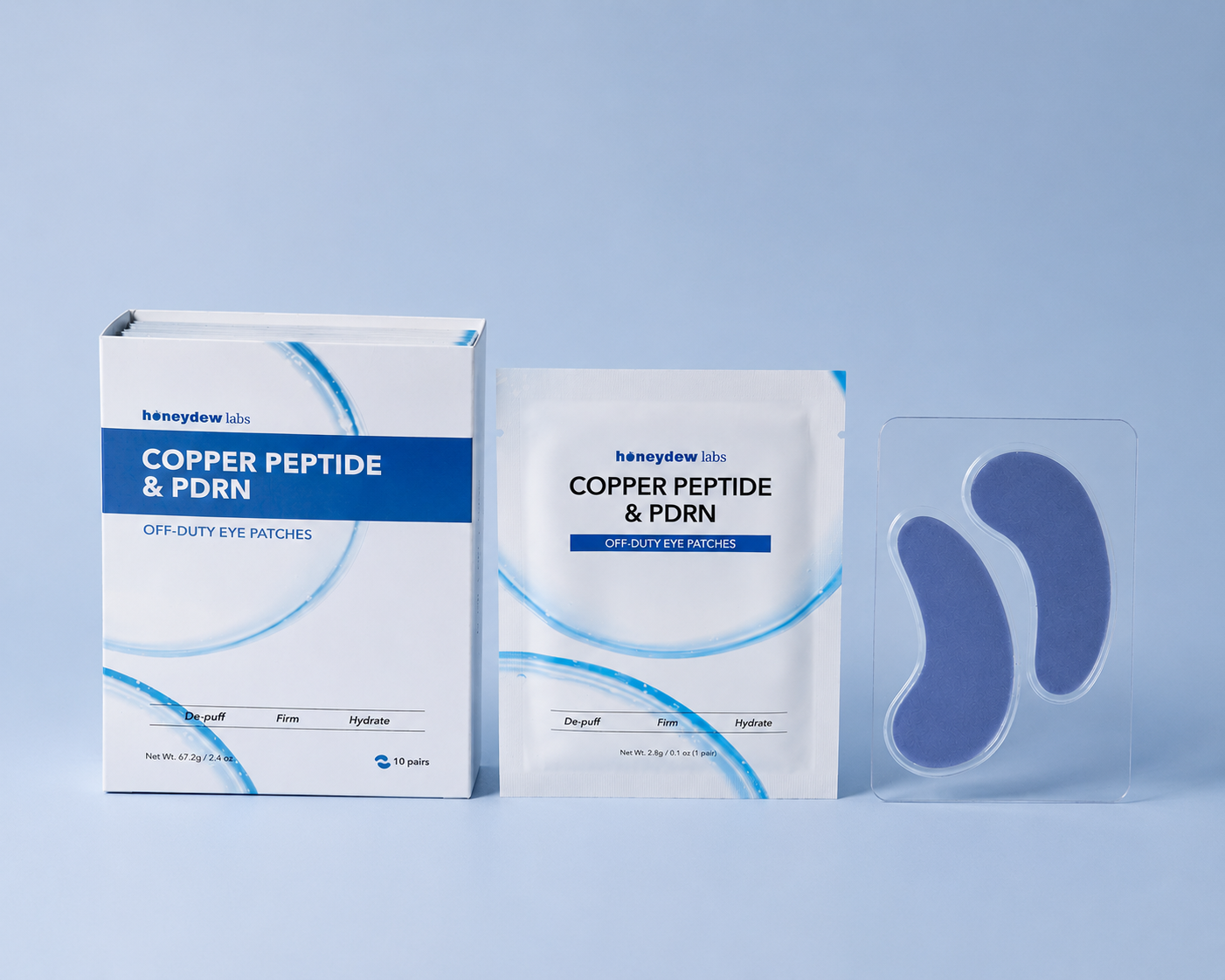
Honeydew Labs Copper Peptide + PDRN Eye Patches — final packaging direction.
The Opportunity
Eye patches were having a moment. We saw an opportunity to get ahead of what could come next.
Major beauty brands were bringing renewed attention to the eye patch category. Products from brands such as Summer Fridays, Topicals, and Rhode helped make under-eye treatments increasingly visible within the broader skincare conversation.
At the same time, ingredient-led skincare continued to influence how consumers discovered and evaluated products. Honeydew wanted to explore how an eye patch built around Copper Peptide + PDRN could enter this growing category with its own point of view.
The opportunity was not simply to launch another eye patch. We needed to create a product that could feel compelling beside established beauty brands while also competing against the large number of alternatives customers encounter on Amazon.
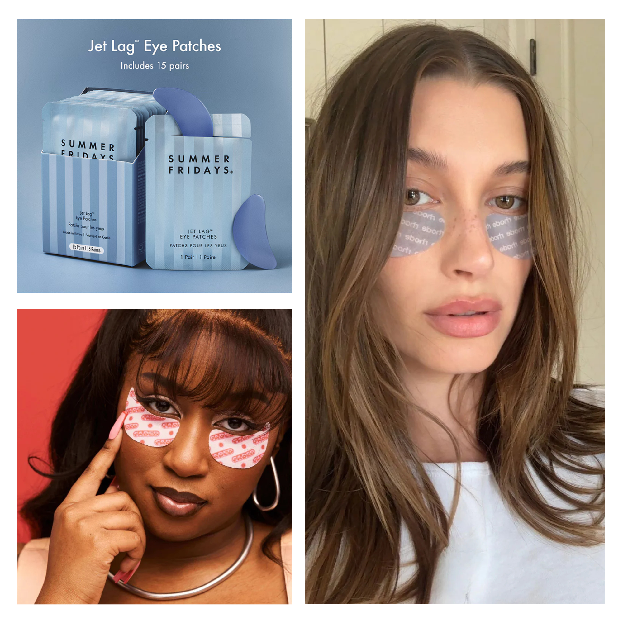
Exploring how established beauty brands use visual identity, product photography, and packaging to position eye patches within the skincare market.
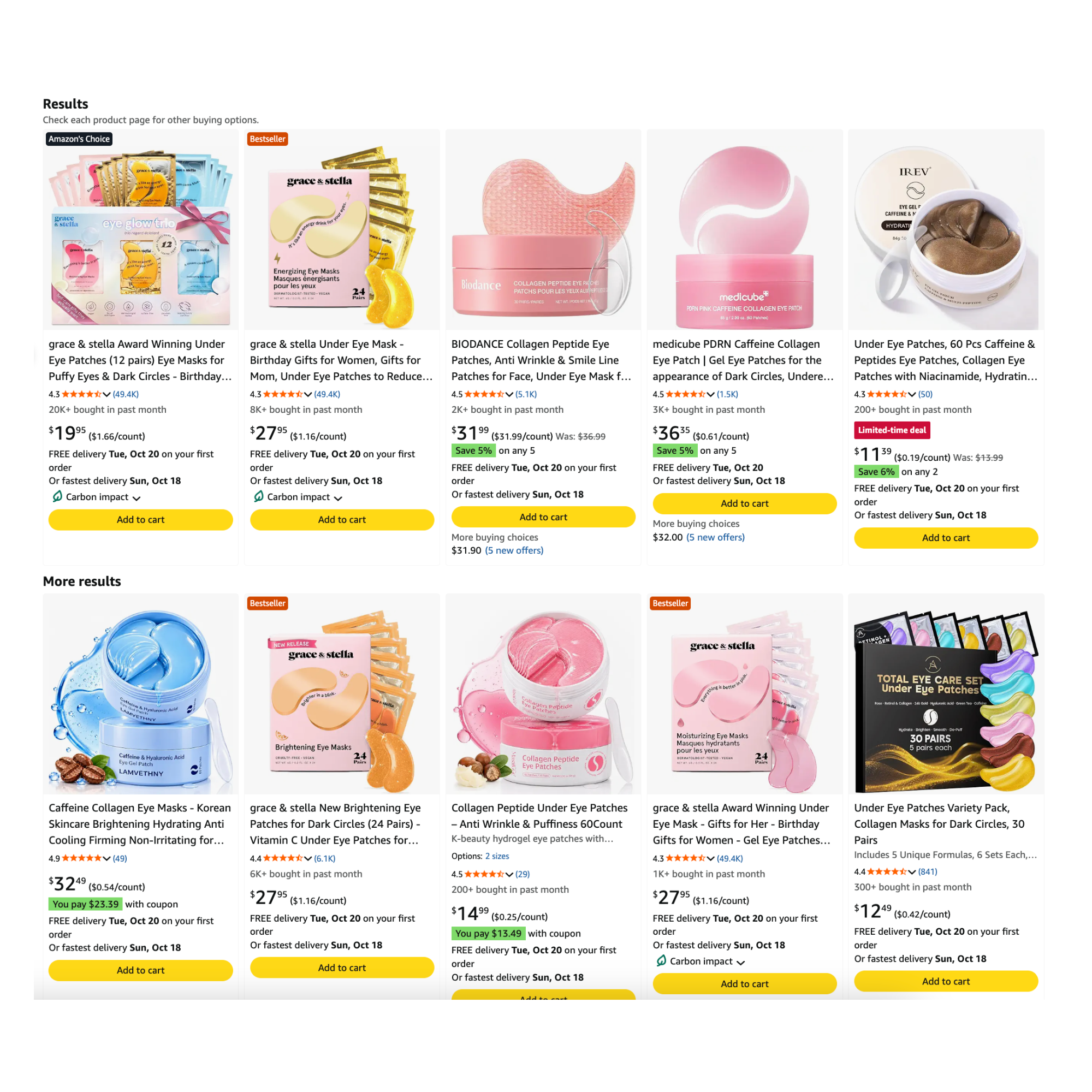
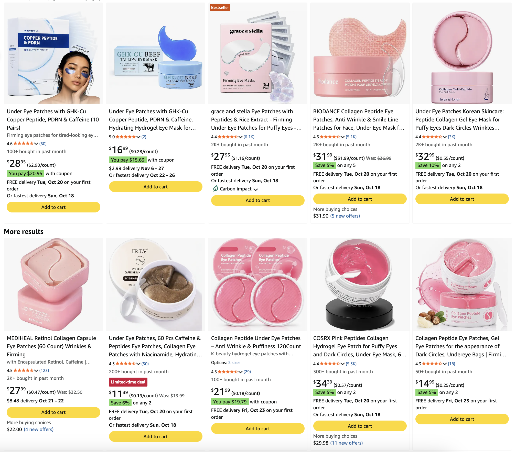
Examining the crowded Amazon marketplace, where similar products compete for attention through colour, packaging, and ingredient-focused messaging.
How might we
How might we design packaging that feels premium and credible while remaining distinctive enough to stand out against established beauty brands and a crowded Amazon marketplace?
Competitive Research
Before designing anything, I wanted to understand the category.
I began by looking heavily into competitors. I studied established beauty brands, emerging skincare companies, and high-performing products across marketplaces to understand how eye patches were being positioned and presented.
I wasn't only collecting packaging that looked good. I wanted to understand why certain products stood out, what made them feel premium, how they communicated ingredients, and where their packaging became difficult to distinguish from the rest of the category.
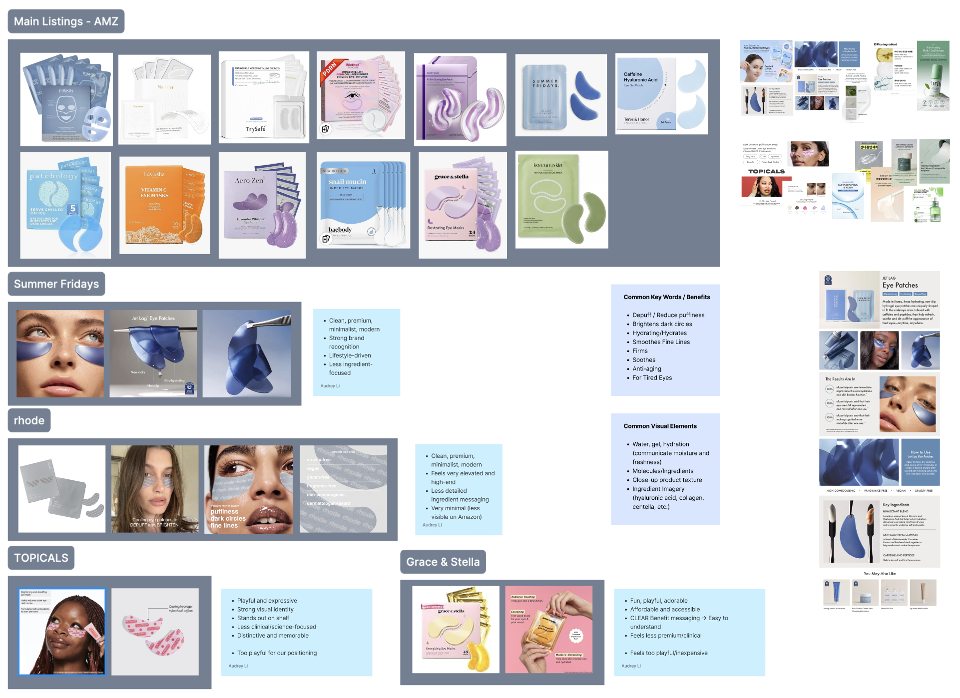
I compared both established beauty brands and marketplace competitors to understand the visual language of the category.
What I Looked For
01
What feels premium?
Which visual decisions make skincare packaging feel considered and elevated rather than generic?
02
What communicates quickly?
How are brands balancing ingredient messaging, product benefits, and brand recognition?
03
What stands out?
Which products remain distinctive when viewed beside dozens of competitors online?
04
What feels overdone?
Which category conventions were becoming repetitive, and where could Honeydew take a different approach?
What I Learned
Research gave me a clearer picture of where Honeydew could fit — and where it could be different.
01
Premium often meant restraint.
The strongest references used hierarchy, spacing, and deliberate typography rather than relying on excessive visual elements.
02
Ingredients needed to be easy to find.
Ingredient-led products benefited from making the product's key differentiators immediately understandable.
03
Digital shelf presence mattered.
Packaging needed enough visual distinction to remain recognizable when reduced to a small marketplace thumbnail.
Design Direction
Honeydew is playful. This product needed a different kind of confidence.
Honeydew's existing hypochlorous acid spray has a fun, lively, and approachable personality. That identity works well for the product, but the eye patches were intended to occupy a slightly more elevated space.
I wanted the new packaging to feel premium and intentional without becoming cold or disconnected from Honeydew. The challenge was finding the right amount of evolution: different enough to signal a new product experience, but familiar enough to still belong to the same brand.
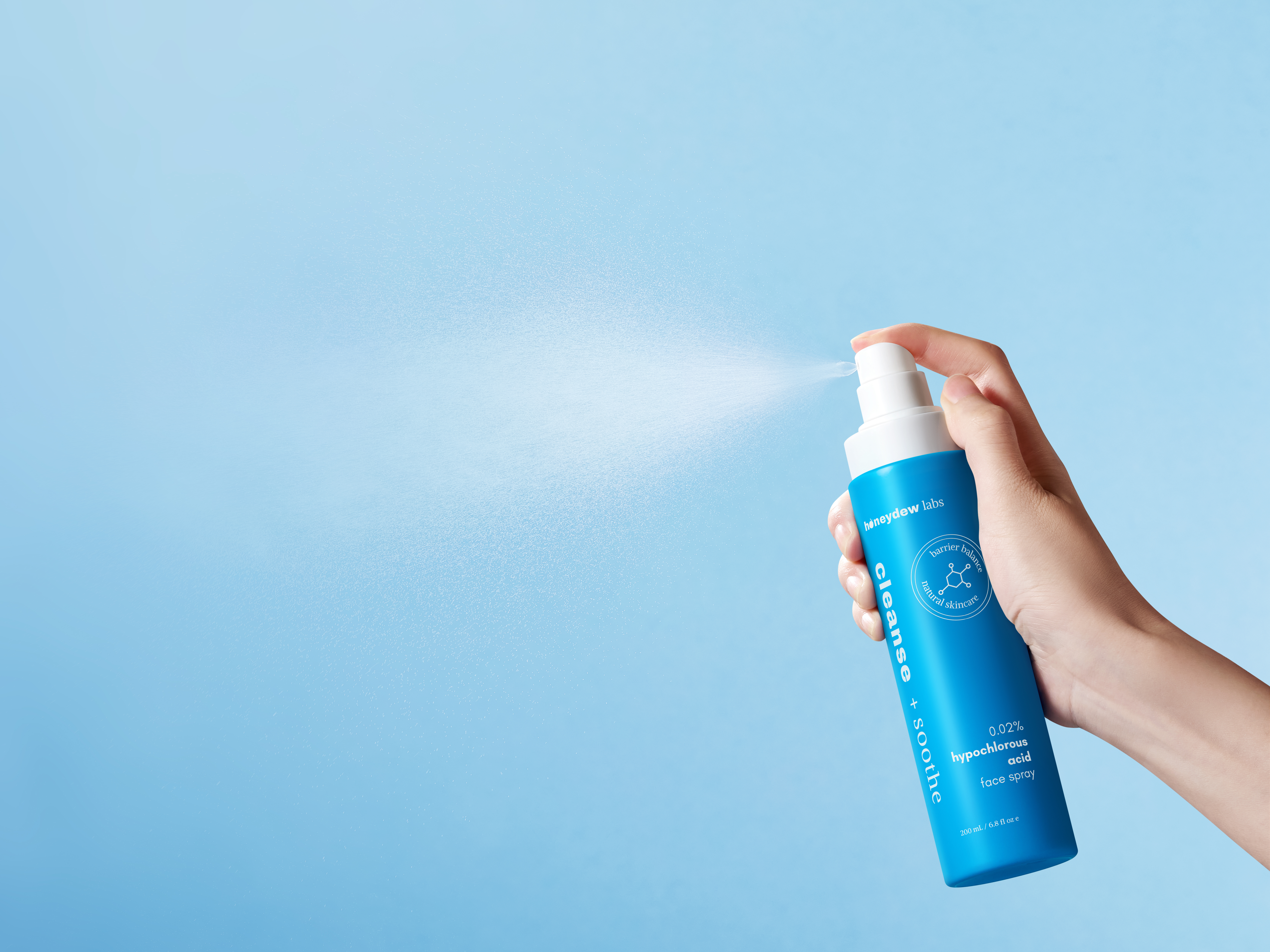
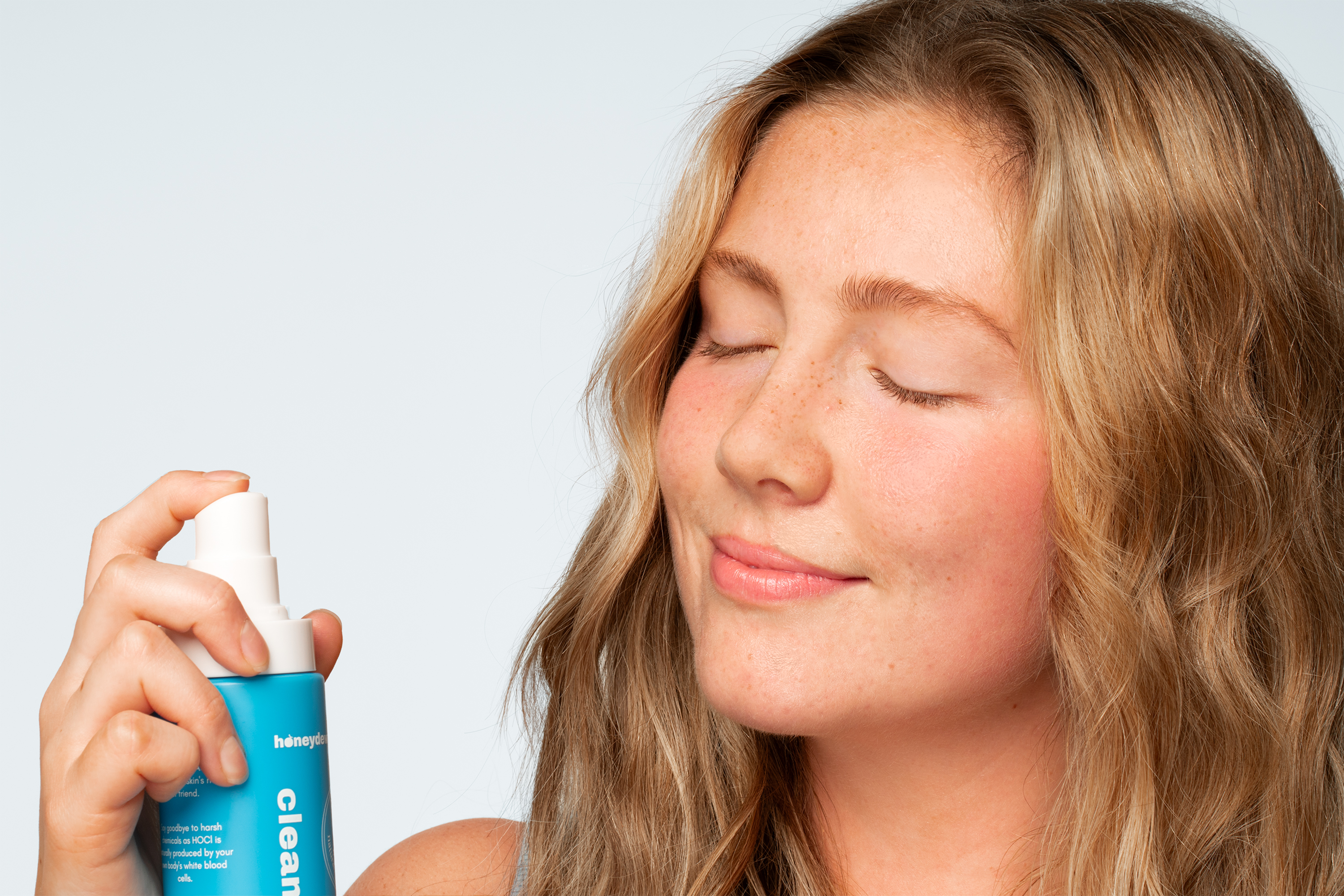
Existing Honeydew Branding
Fun, lively, approachable, and expressive.
Visual Direction
Translating the strategy into a visual language.
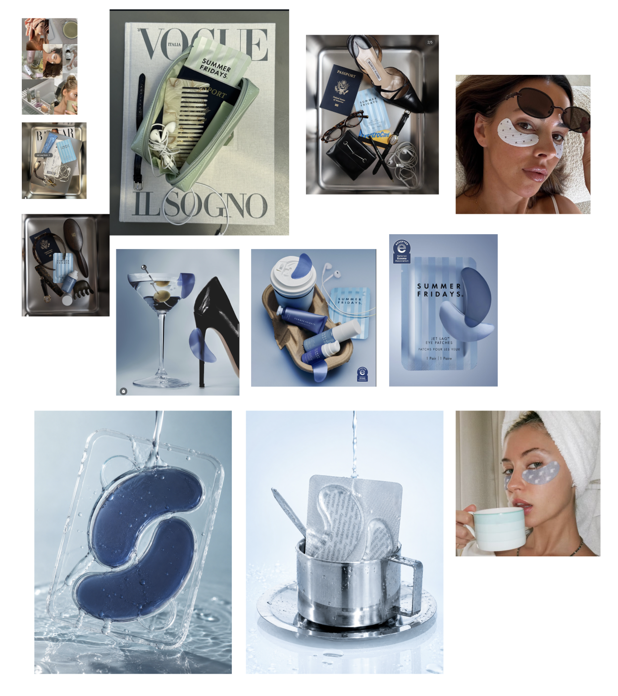
Exploring premium skincare aesthetics through typography, colour, materials, and ingredient-inspired imagery to establish a more elevated visual direction for Honeydew.
Design Principles
01
Elevated, not inaccessible
Create a more premium expression without making the product feel cold or overly clinical.
02
Clear at a glance
Make the product type and key ingredients understandable without requiring customers to search for them.
03
Distinctive in context
Design for the real competitive environment, including crowded marketplace search results.
Exploration & Iteration
Exploring different directions, then refining the strongest one.
With a clearer visual direction in mind, I began exploring how the eye patches could come to life through packaging. I developed four initial concepts, each taking a different approach to typography, colour, composition, and information hierarchy.
These explorations helped me understand how different design decisions influenced the overall personality of the product. Some directions felt more clinical and ingredient-focused, while others leaned toward a more expressive, beauty-led aesthetic.
Initial Concepts
Four concepts, each exploring a different visual personality.
I explored multiple directions rather than committing to a single concept early on. This allowed me to compare how typography, colour, and layout could communicate different levels of premium positioning and scientific credibility.
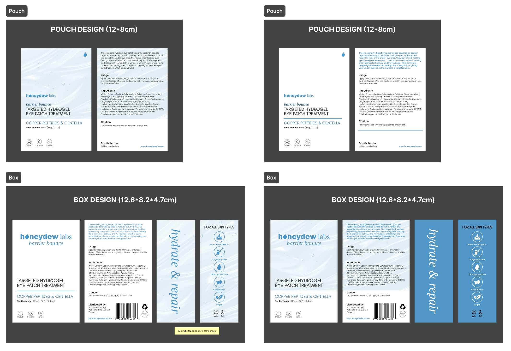
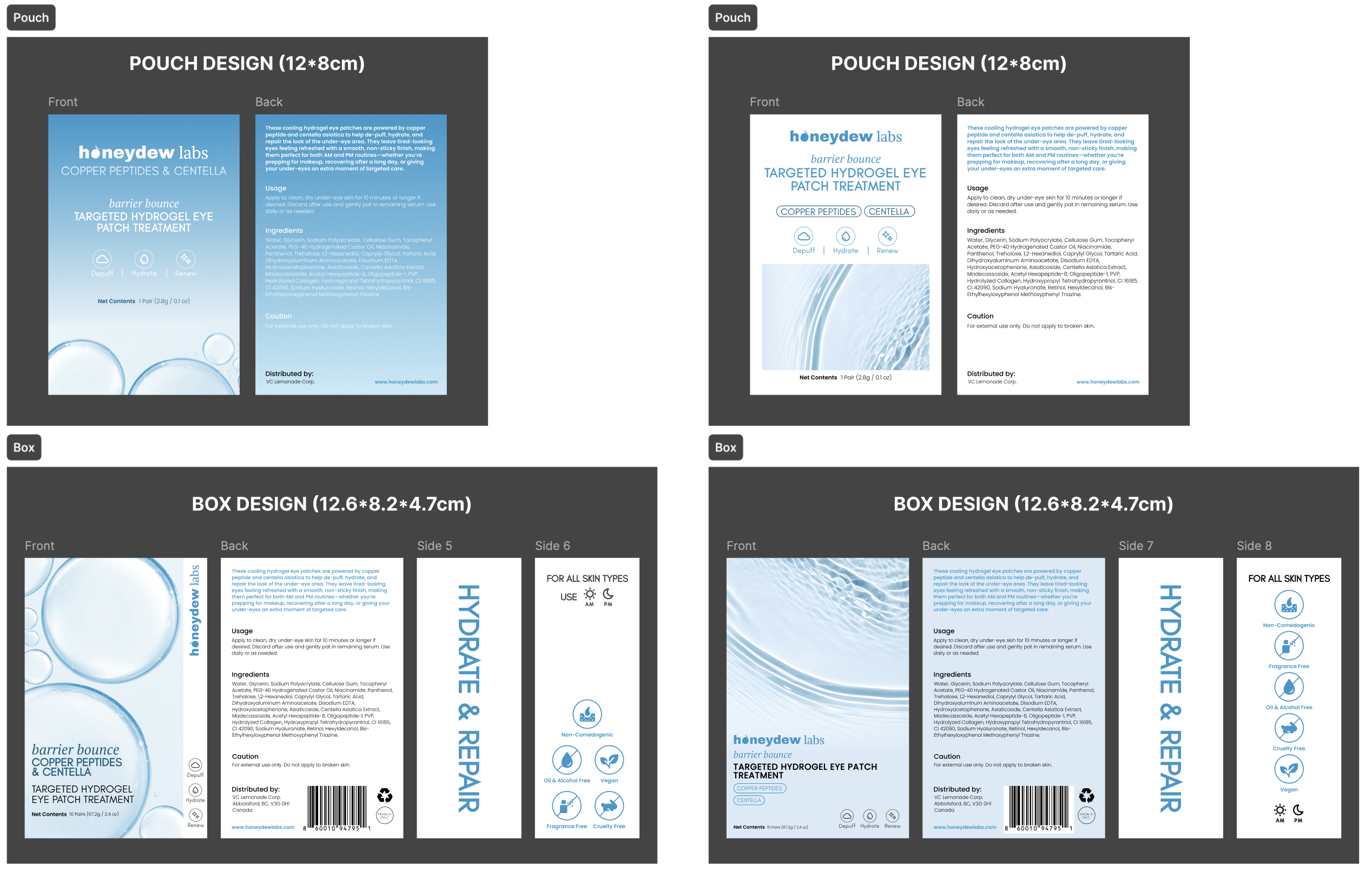
Initial packaging explorations presenting four different visual directions for the Copper Peptide + PDRN Eye Patches.
Feedback & Refinement
Working with the co-founders to narrow the direction.
After developing the initial concepts, I presented the directions to Honeydew's co-founders. Together, we discussed which elements best reflected the product's positioning and how the packaging could feel more elevated while remaining recognizable as part of Honeydew.
Based on their feedback, I narrowed the concepts down and continued refining the selected direction. I focused on strengthening the visual hierarchy, simplifying the composition, and making the key product information easier to understand at a glance.
01
Strengthen hierarchy
Make the product name, key ingredients, and supporting information easier to scan and understand.
02
Reduce visual noise
Remove elements that competed for attention so the packaging could feel more deliberate and premium.
03
Design for small sizes
Consider how the packaging reads when reduced to the scale customers may encounter on an online marketplace.
Final Visual Identity
Establishing a cohesive visual language through typography and colour.
After reviewing the initial concepts with Honeydew's co-founders, I refined the selected direction into a more cohesive visual identity. Typography and colour became two of the most important elements in balancing a premium skincare aesthetic with clear, ingredient-led communication.
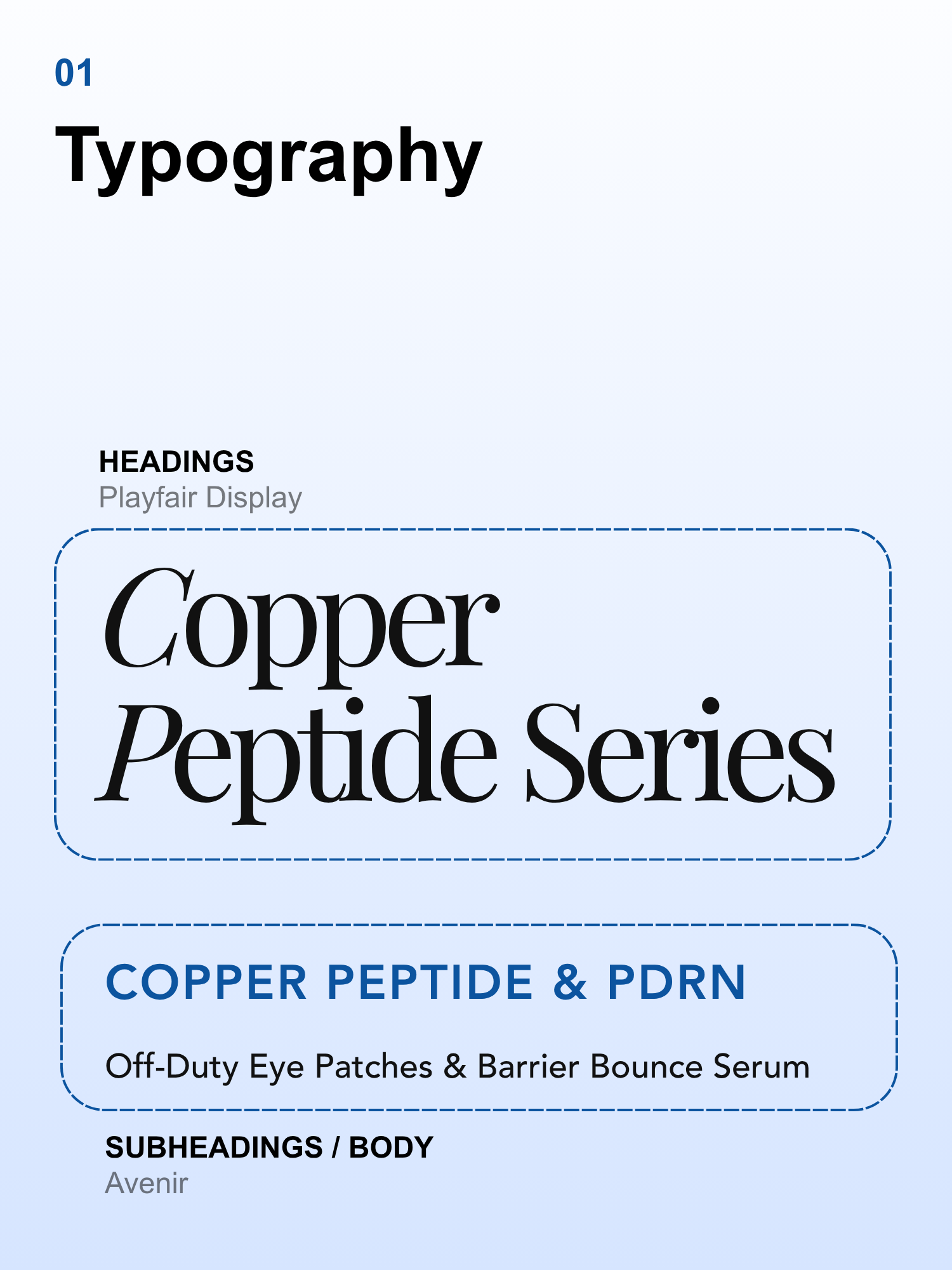
01 — Typography
Playfair Display introduces an elevated editorial quality, while Avenir provides clarity and readability for product information.
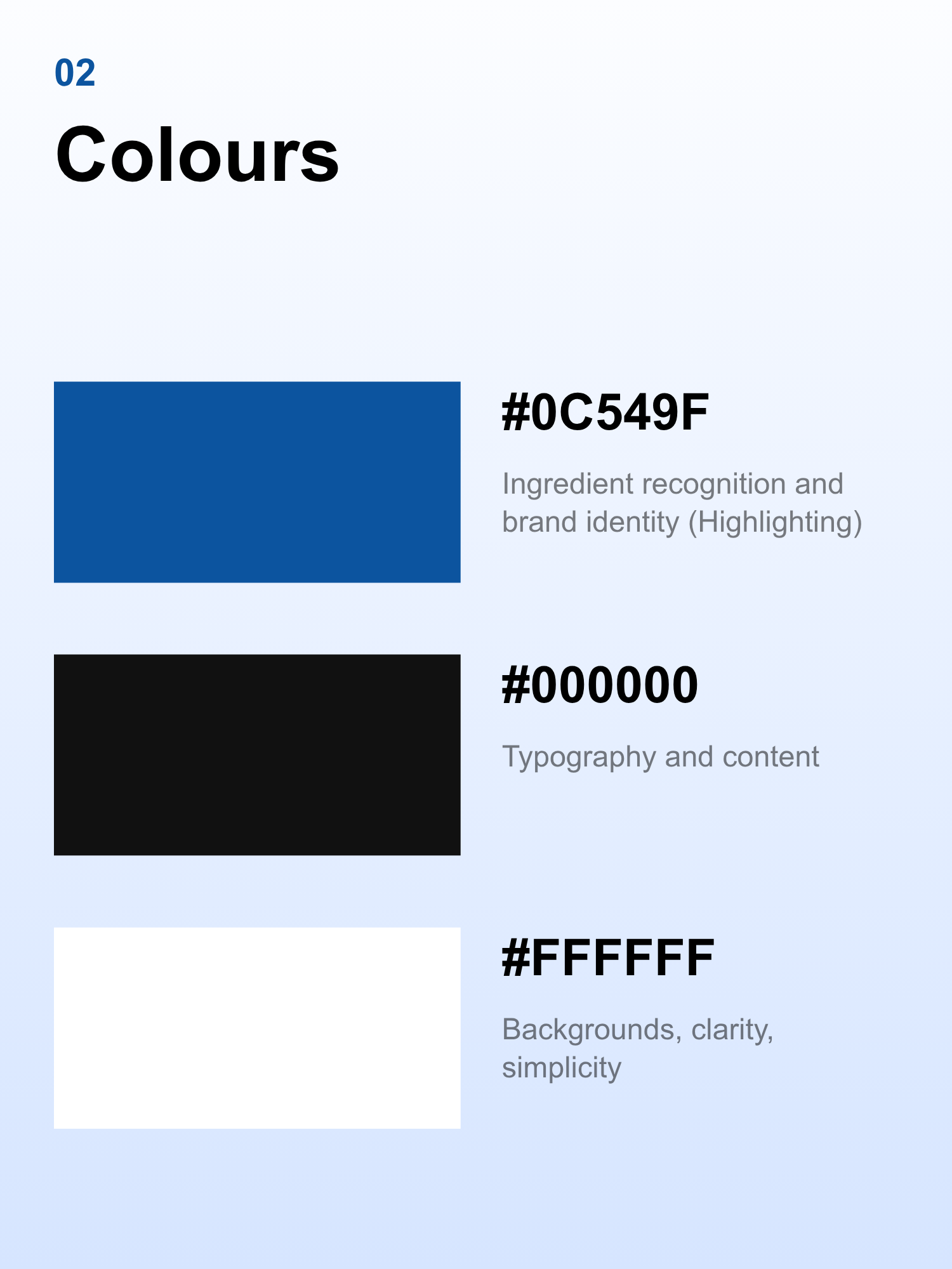
02 — Colour Palette
Copper blue (#0C549F) establishes ingredient recognition and visual distinction, supported by black and white for contrast, simplicity, and clarity.
Selected Direction
Bringing the refined direction across the box and pouch.
The selected direction brought together a more refined visual language with clearer ingredient-led messaging. I applied the same design system across both the outer box and individual pouch to create a cohesive product experience.
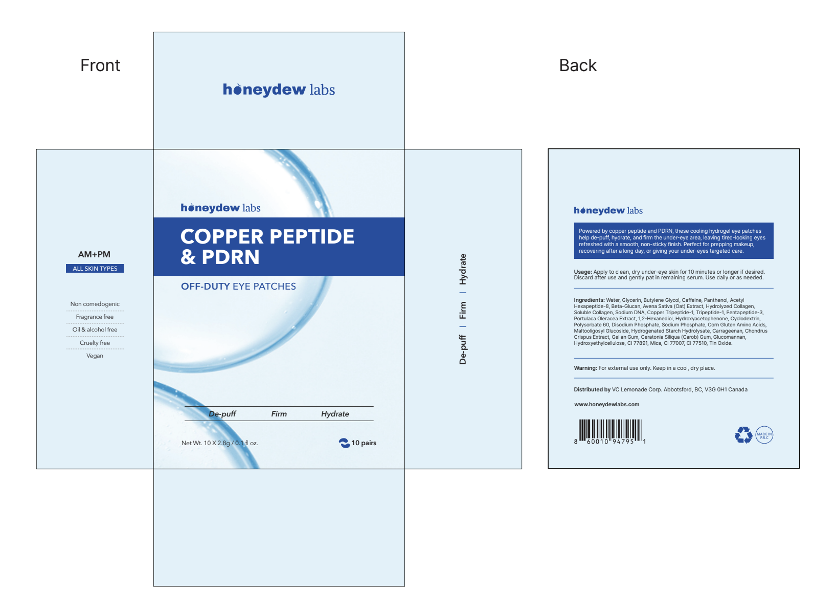
Outer Box
The refined outer packaging establishes the product's visual identity through typography, colour, and ingredient-focused hierarchy.
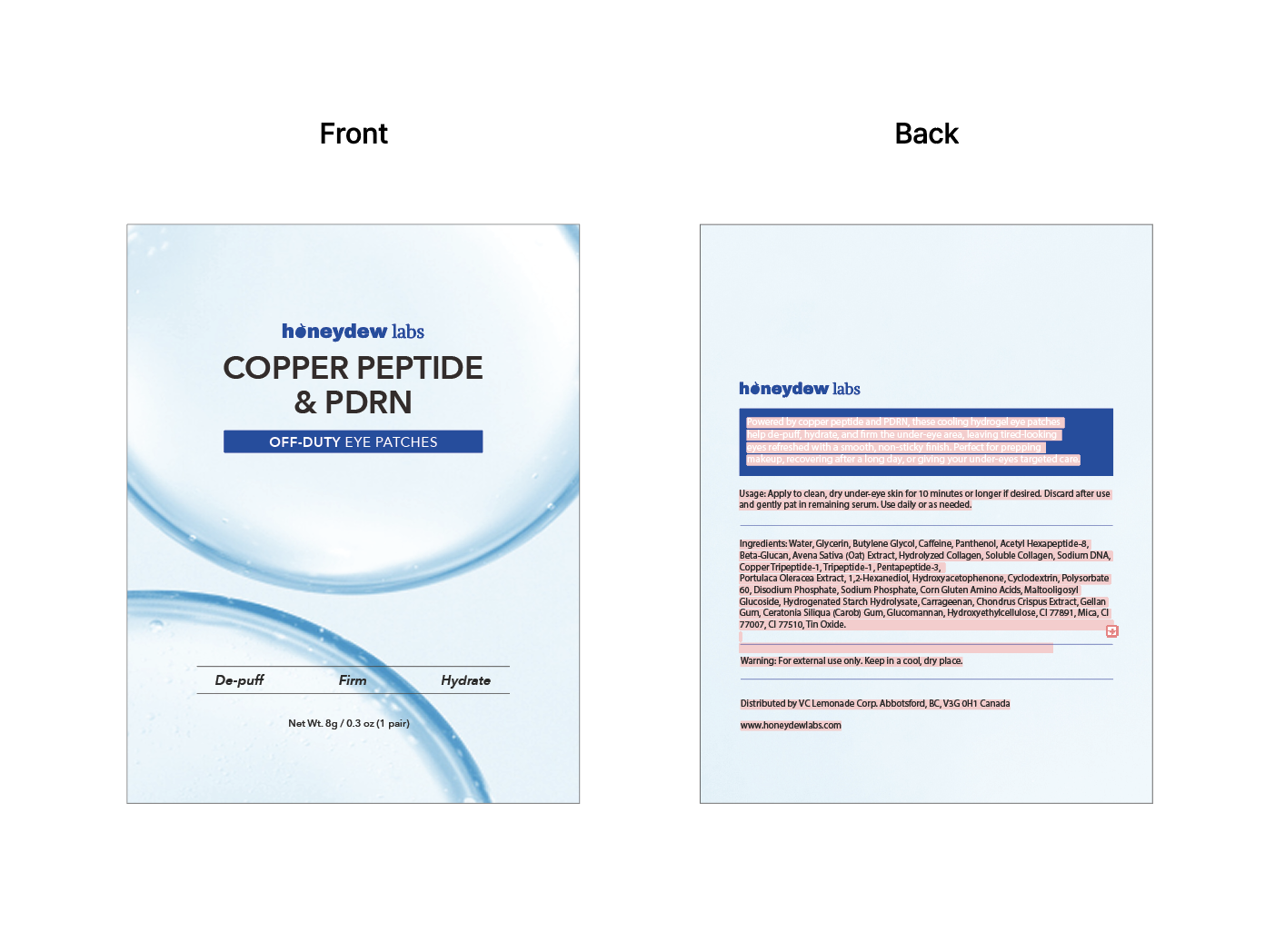
Individual Pouch
The individual pouch carries the same visual language into a smaller format, maintaining consistency across the product experience.
Final Design
Introducing Honeydew's Copper Peptide + PDRN Eye Patches.
The final direction brings together the product's ingredient-led positioning with a more elevated visual identity for Honeydew.
The packaging was designed to feel distinct from the brand's more playful products while remaining approachable and recognizable as part of Honeydew's growing product portfolio.
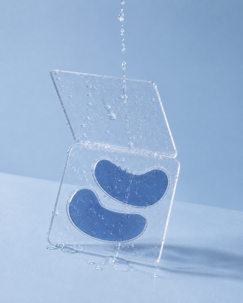
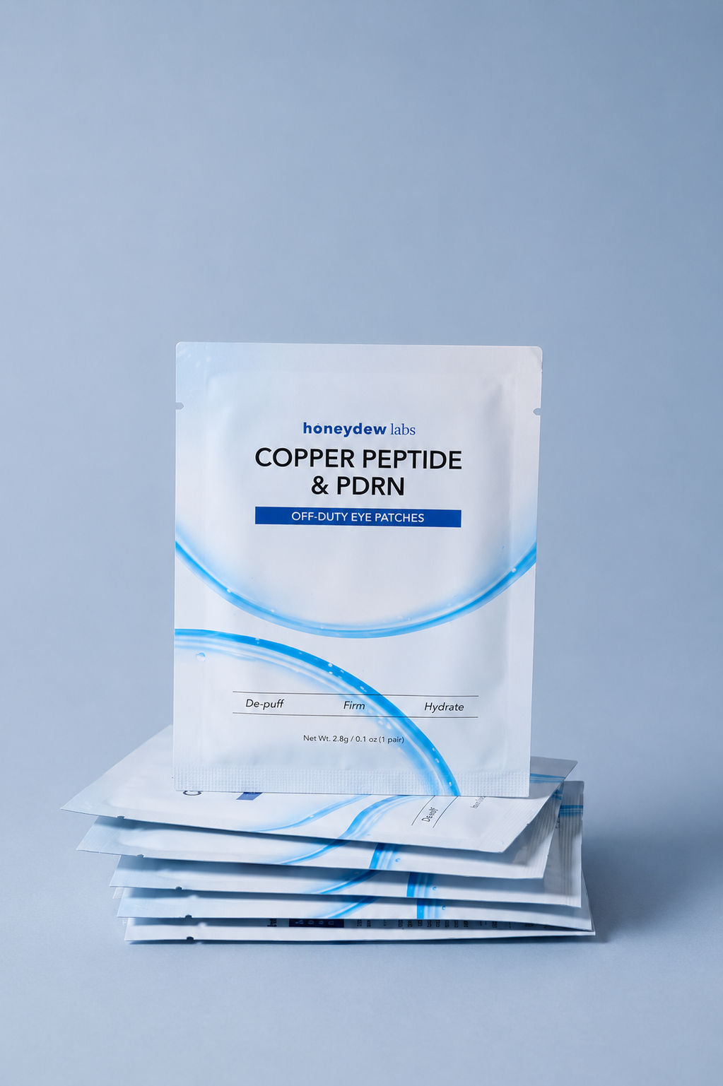
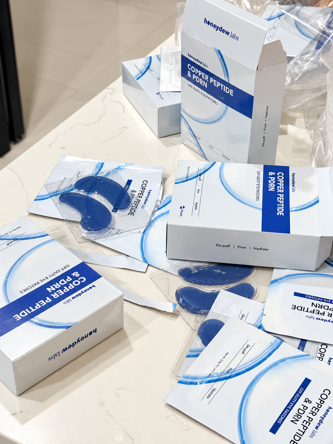
A closer look at the final Copper Peptide + PDRN Eye Patches, from the outer packaging and individual pouches to the complete product experience.
Marketplace Context
Designed to hold its own in a crowded marketplace.
Throughout the process, I kept returning to the environment where many customers would actually discover the product. The packaging needed to communicate clearly not only in a polished product shoot, but also when surrounded by competing skincare products.
Outcome
Helping Honeydew enter a new skincare category with a new visual expression.
This project gave me the opportunity to contribute to a new physical product from early competitive research through packaging exploration and refinement.
The final direction represents a more elevated side of Honeydew while responding to the realities of the category it is entering: strong established brands, ingredient-conscious customers, and a highly competitive digital shelf.
01
A new product identity
The eye patches introduced a more elevated visual expression while remaining part of Honeydew's broader brand.
02
Designed for competition
The packaging was considered in the context of both established beauty brands and crowded online marketplaces.
03
Research into execution
Competitive analysis directly informed the visual direction, exploration, hierarchy, and refinement of the packaging.
Reflection
Designing packaging taught me to think beyond how something looks.
01
Research gave the design context.
Studying competitors helped me understand not only what looked good, but why certain products felt premium, recognizable, or easy to understand.
02
Packaging is a product experience.
The package shapes how customers understand the product, its positioning, and the value they expect before they ever use it.
03
Brand systems need room to evolve.
Creating a more elevated product did not mean abandoning Honeydew's identity. It meant finding a new expression that still felt connected to the brand.
End of case study